Lumae: Designing a User-Centered Mindfulness App and Brand
A bootcamp project documenting the complete UX/UI design process process.
Last updated April 6, 2025.
Lumae makes breathwork approachable, guiding users through simple exercises to calm the mind and body.


EXECUTIVE SUMMARY
Lumae’s Origin Story
Lumae started with a simple truth: Everyone wants better sleep, but stress gets in the way. Breathwork was the solution—we just made it accessible.
Problem
57% of Americans report needing more sleep (Gallup, 2024). Like most people I know, stress was sabotages rest and most people have never heard of breathwork exercises.
Insight
User interviews & research revealed:
Quieting the mind and body before rest helps improve sleep quality
People trust tried-and-true wellness methods.
80% knew little about breathwork’s relaxation benefits.
Solution
Lumae teaches the 4-7-8 breathing technique through a calm, low-sensory app, that bridges the gap between stress and rest.
Validation
75% of testers felt calmer after use.
Features like auto/manual controls were shaped by user feedback.
Project Scope
Role
UX/UI Designer & Brand Designer
Timeline
Phase 1: 14 weeks
Skills
User Research, Information Architecture, Wireframing, User Testing, Prototyping, Visual Design, Interactive Design, Brand Development, & Wireframing
Tools Used
Chat GPT, FigJam, Figma, Leonardo.ai, Loom, Lyssna, Mobbin & Supernormal
Case Study Versions
Goals & KPIs
Improve Ease of Use
KPI: Achieve a usability score of 4/5, with 100% of users successfully navigating the app from start to finish.
Focus: Ensure the app is intuitive, with clear user flows and easy task completion.
Design the Brand
KPI: 75% of users report feeling calmer after using the breath exercise.
Focus: Assess user response to the app’s aesthetic and functionality, aiming to create a calming experience.
Align with User Expectations
KPI: Design the app to align with users’ intuitive expectations, prioritizing the most common preferences.
Focus: Minimize cognitive load, especially for beginners, by streamlining the app’s process flow.
RESEARCH & DISCOVERY
I started with the general idea of having a discussion with users about social emotional learning and intelligence.
General Competitive Analysis
Headspace: An everyday mental health app that offers meditations, mindfulness exercises, and a variety of sleep techniques.
Mindset : An app that makes daily self-care and wellness easy through storytelling and sharing
The 5-min Journal: An app that helps people practice daily gratitude in just 5-min a day.
General Competitive Analysis - View in Figma

I explored the wellness app market to understand what users expect and what’s missing. I noticed no competitors focused on rest exercises—an insight that helped shape the project and showed the need for a deeper competitor analysis.
User Interviews
User Interview Stats
5 Total Participants
3 remote / 2 in-person
3 women / 2 men
4 ages 37-43 years / 1 10 year old
3 not parents / 2 parents
4 employed full-time / 1 stay-home parent
Key User Takeaways
80% of users struggle to calm their minds before sleep.
Average sleep time: 7.6 hours (7.3 for adults).
Everyone was open to trying breathwork for better rest.
Participants valued familiar methods like meditation, yoga, exercise, supplements, and sleep aids.
User Interview Participants & Their Preferred Resources - Created in FigJam

Affinity mapping from user interviews revealed that while users had go-to tools for mental health, breathwork wasn’t one of them—though better sleep was a common need.
Frequency of Trouble Sleeping
2 participants had trouble sleeping weekly or daily.
2 experienced it occasionally (weekly or monthly).
1 rarely had issues, usually only when stressed or worried.
User Interview Insights
Many participants shared that poor sleep affects their daily lives. This led me to dig deeper and validate how common sleep issues really are.
I found that users prefer simple, proven wellness solutions. When I hit gaps in the research, I followed up with interviewees to learn more and fill in the blanks.
Key Insights from Secondary Research
Gallup (2024) reports that 57% of Americans say they need more sleep.
Yale Medicine says most adults should get 7-9 hours a night, while those aged 65+need 7-8 hours.
Gallup (2024) also links stress to poor sleep quality—something echoed in user interviews, where stress and anxiety were the top reasons people struggled to rest.
Gallup Pole Results About Stress and Sleep
(validates user need)
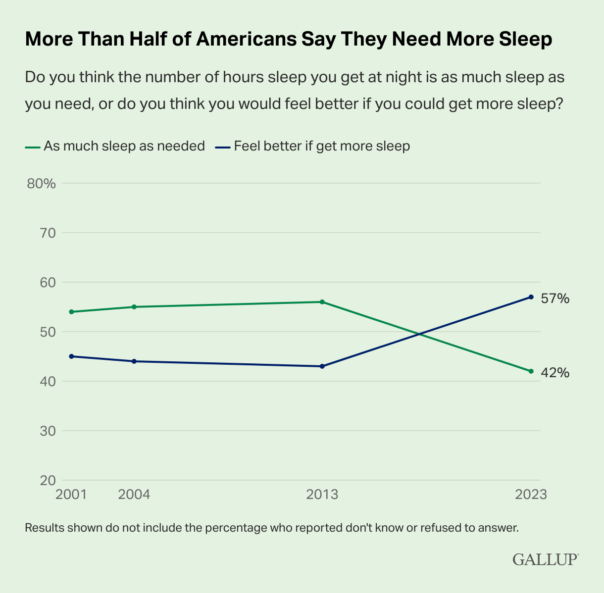
More than half of Americans say they need more sleep.
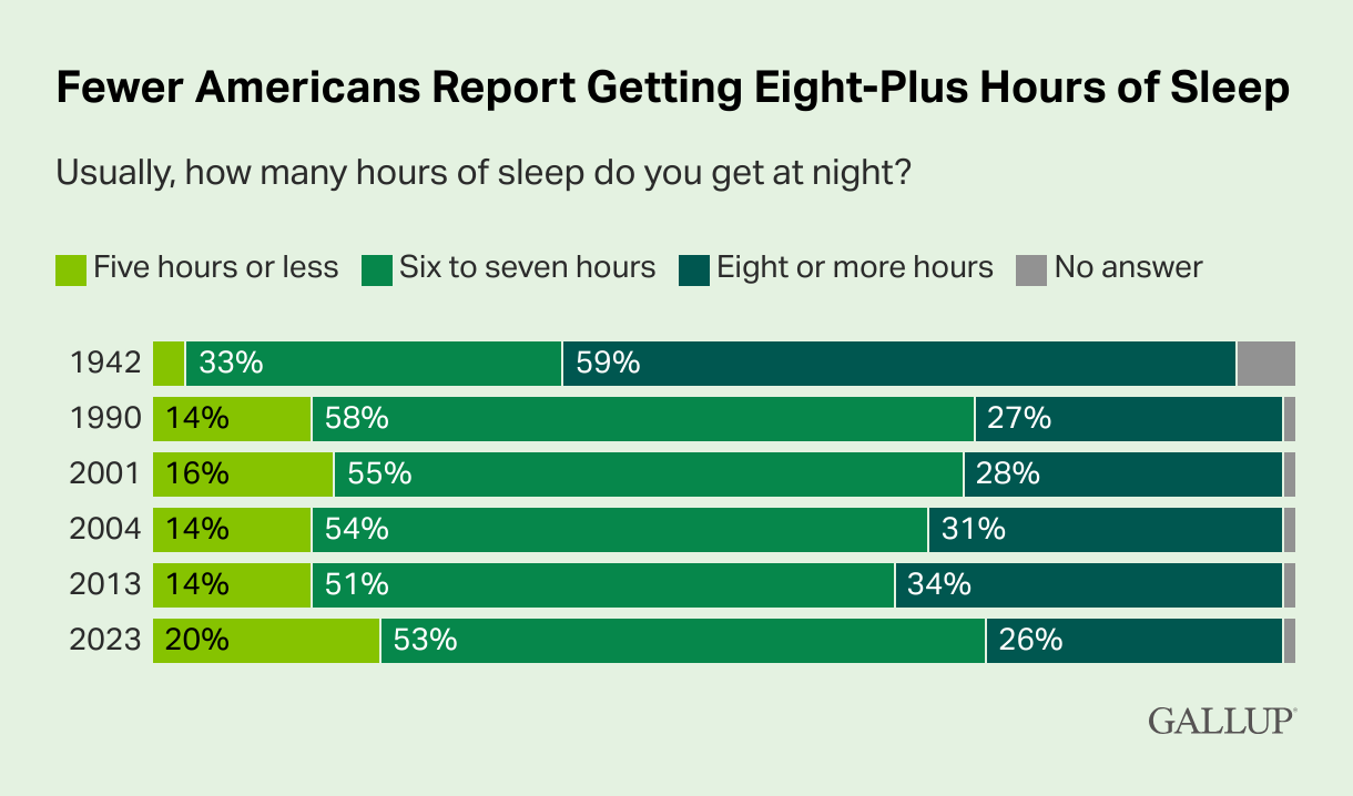
Fewer Americans report getting 8+ hours of sleep.

Stress is rising for Americans over the past three decades.
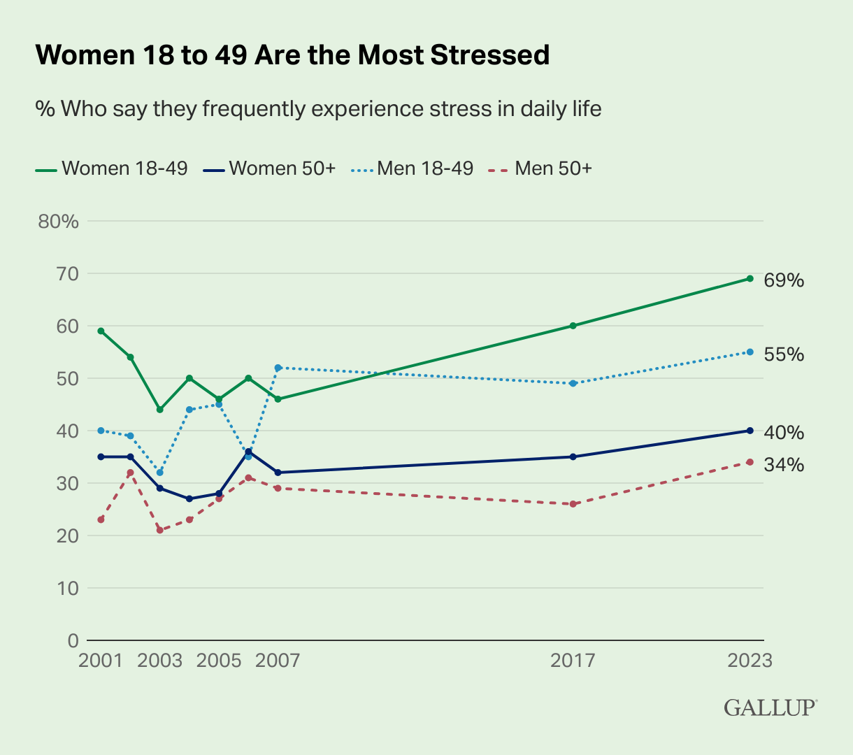
Mean & women ages 18-49 are the most stressed.
Focused Competitive Analysis
With better rest as the goal, I ran a second, more targeted market analysis. I looked at 5 key competitors—apps that use various meditation methods to support daily wellness.
Focused Competitive Analysis - View in Figma
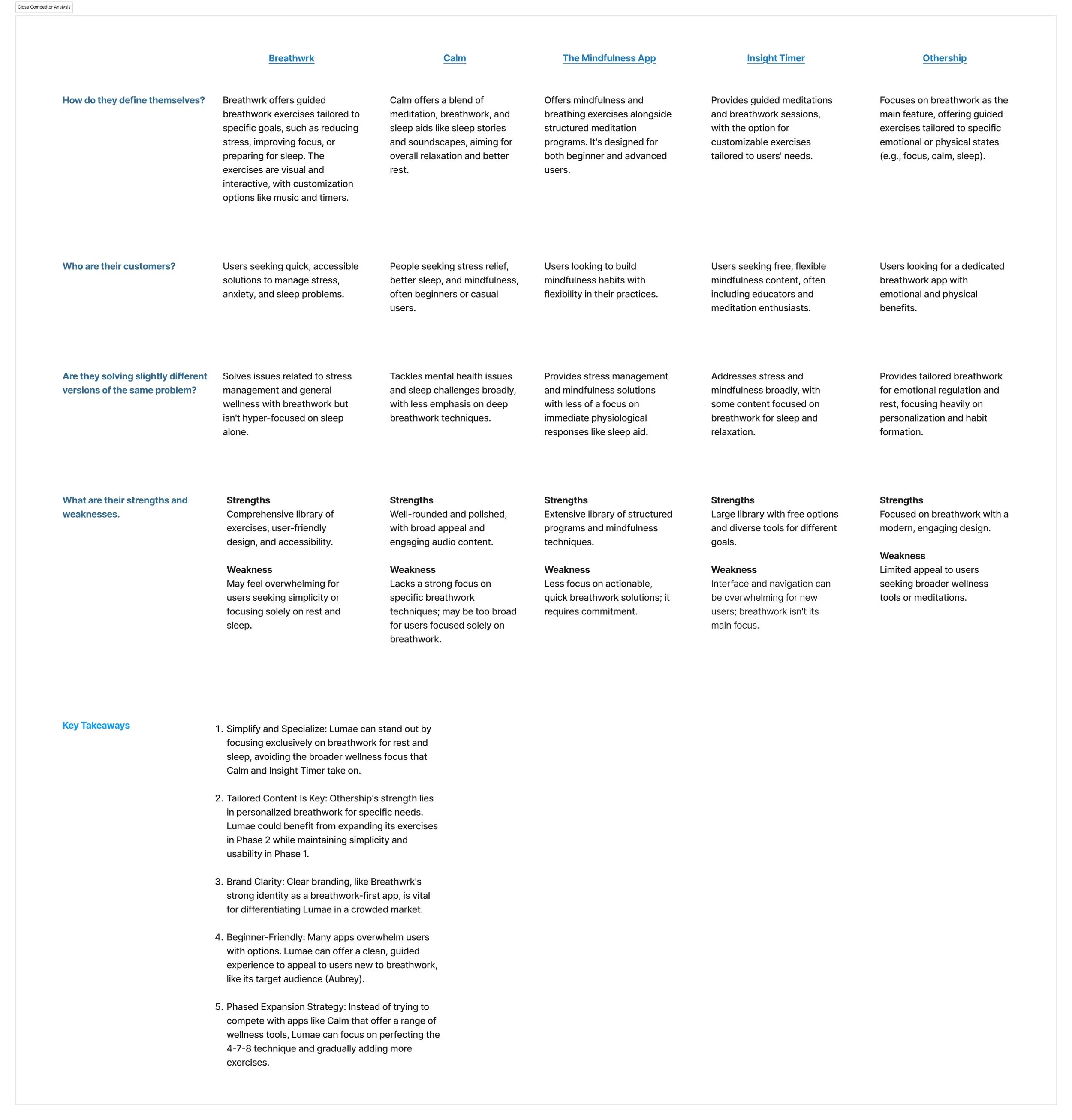
I reviewed the FigJam data and used AI to pull key insights. To stand out, Lumae should focus solely on breathwork for rest and sleep—unlike broader wellness apps. A strong brand identity and a beginner-friendly, uncluttered experience will help set it apart.
Focused Competitor Analysis Overview - View in Figma
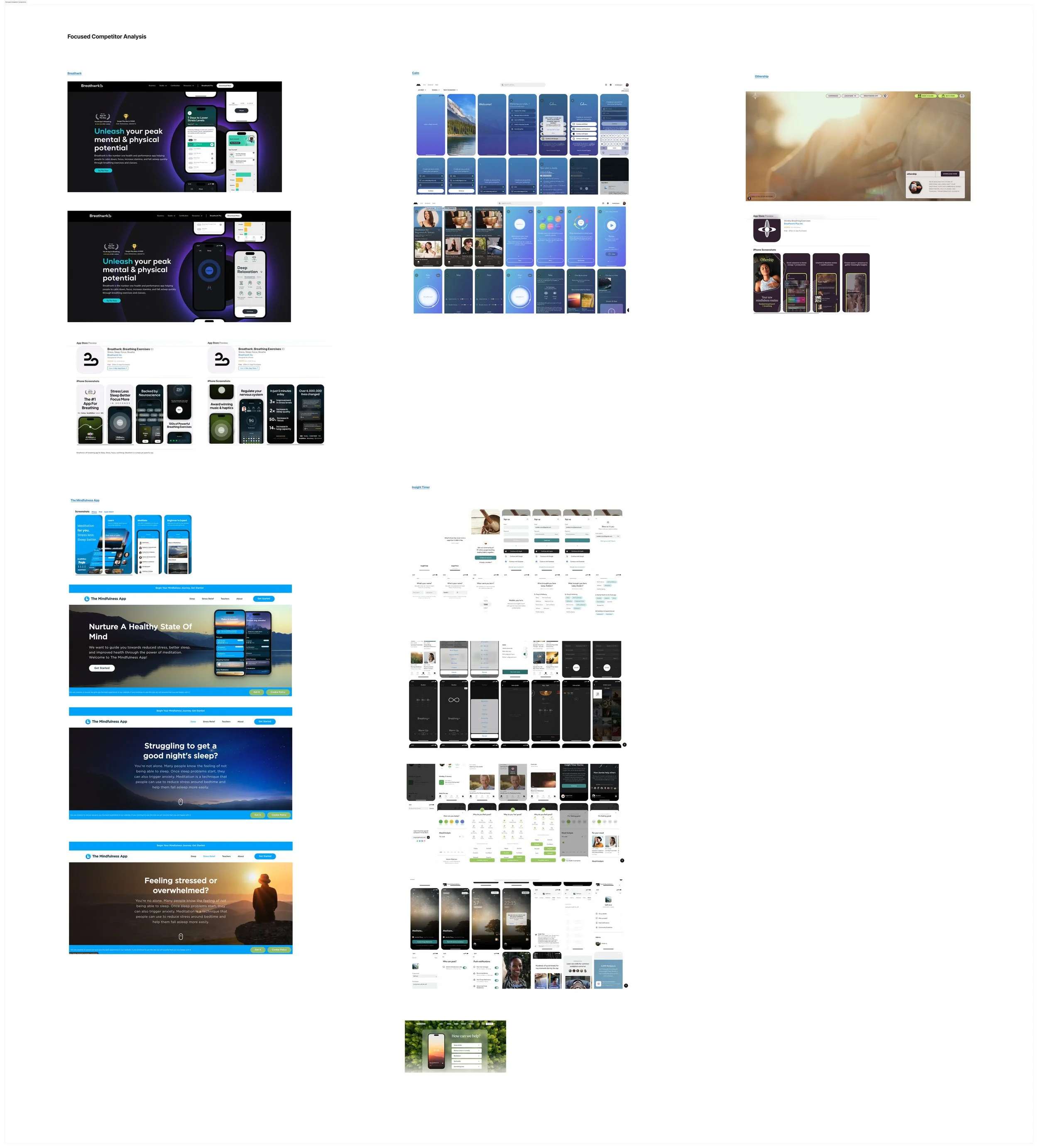
Most competitors offer a range of general wellness tools, not specifically focused on rest or sleep. Only one app centered on breathwork, while others included it as just one of many methods.
Research Phase Project Impact
Primary and secondary research revealed that users struggle to calm their minds and bodies for rest. Most competitors offer a range of wellness methods, but their content-heavy apps make it hard to find specific solutions. This creates an opportunity to provide a simple, beginner-friendly experience.
There’s a gap in specialized sleep and rest options. We decided to focus on breathwork, as 80% of users were unfamiliar with it or hadn’t tried it, despite its effectiveness in priming the body for rest.
DEFINE PROBLEM & STRATEGY
How might we help people improve their rest or sleep using proven, accessible methods?
Research focused on improving sleep and rest for young people, narrowing the project scope and informing the strategy.
Research Phase Contributions
User interviews highlighted a preference for simple, proven wellness methods.
Users favored meditation, exercise, diet, time outdoors, and supplements (both recreational and prescribed).
Competitors offered meditation, affirmations, breathwork, fitness, emotional regulation, habit tracking, community support, and sound therapy.
I researched effective, accessible methods and found breathwork to be promising. Further interviews confirmed user familiarity with it.
Key Takeaways
The 4-7-8 breath technique, known for reducing stress and anxiety, aligned with user values and became the app’s core feature.
Breathwork is widely accepted by wellness professionals as effective for many people.
80% of interviewees had heard of breathwork but hadn’t tried it, showing openness to exploring it.
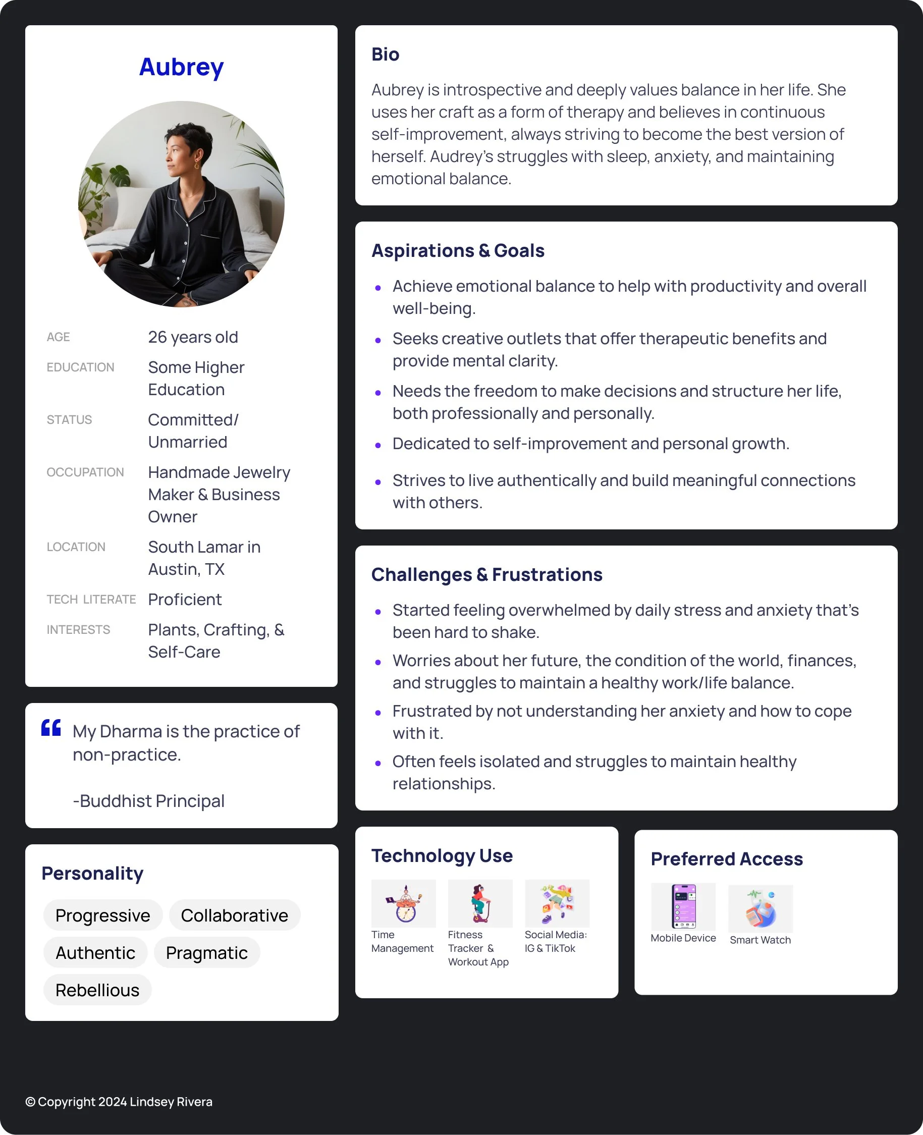
Lumae’s User Persona - Meet Aubrey
Brainstorming Different Solutions
I designed a breathwork app to help users relax before sleep. A comparative analysis revealed that while one app focused on breathwork, most competitors offered a mix of wellness methods. Breathwork stood out due to its unique components.
Design Decisions for Aubrey
Aubrey values simplicity and proven wellness methods, so the app needed to be easy to navigate with a calm, muted color palette to avoid overstimulation. As a breathwork beginner, she needed clear, jargon-free language and step-by-step guidance, so the exercise was renamed from "Pranayama" to the more familiar "4-7-8 Breath Technique”.
Sub Feature Analysis and Micro Interaction Considerations

After identifying the main feature, I focused on the supporting sub-features and the branding elements needed to structure the breath exercise.
STRUCTURE THE EXPERIENCE
A clear Information Architecture ensures users can navigate the app effortlessly and complete tasks, like starting and finishing a breath exercise, without confusion. Poor IA can lead to frustration and abandonment.
Task Prioritization
Core Flow Design
Refined the primary breath exercise components and prototype. I started by defining the happy path.
Information Architecture (IA)
Structured content and navigation, using Mobbin for inspiration on sitemap and menu hierarchy.
User & Task Flows
Designed loading screens and pre-exercise screens to guide users before starting the breath exercise.
Testing & Iteration
Continuously tested and simplified the user experience from launch to completing the breath exercise.
Core Flow Design
The breath exercise had to feel intuitive, with clear visuals guiding users through each step and tracking progress. The interface focused on calming visuals and minimal distractions. I started with manual progression to align with beginner preferences and later added an automatic cycling option after perfecting the manual flow.
Information Architecture & General Flows
User & Task Flows v1.0

Aubrey opens the app, navigates through personalized settings, and sees two options: log in/create an account or try the breath exercise. She needs quick access to the exercise without logging in, but the login button was included to plan for the subscription features.
Defining the user flow outlined the core path: after selecting the breath exercise, the user views an overview, follows the steps, and completes the exercise.
Defining the Core Flow
User & Task Flows v1.1
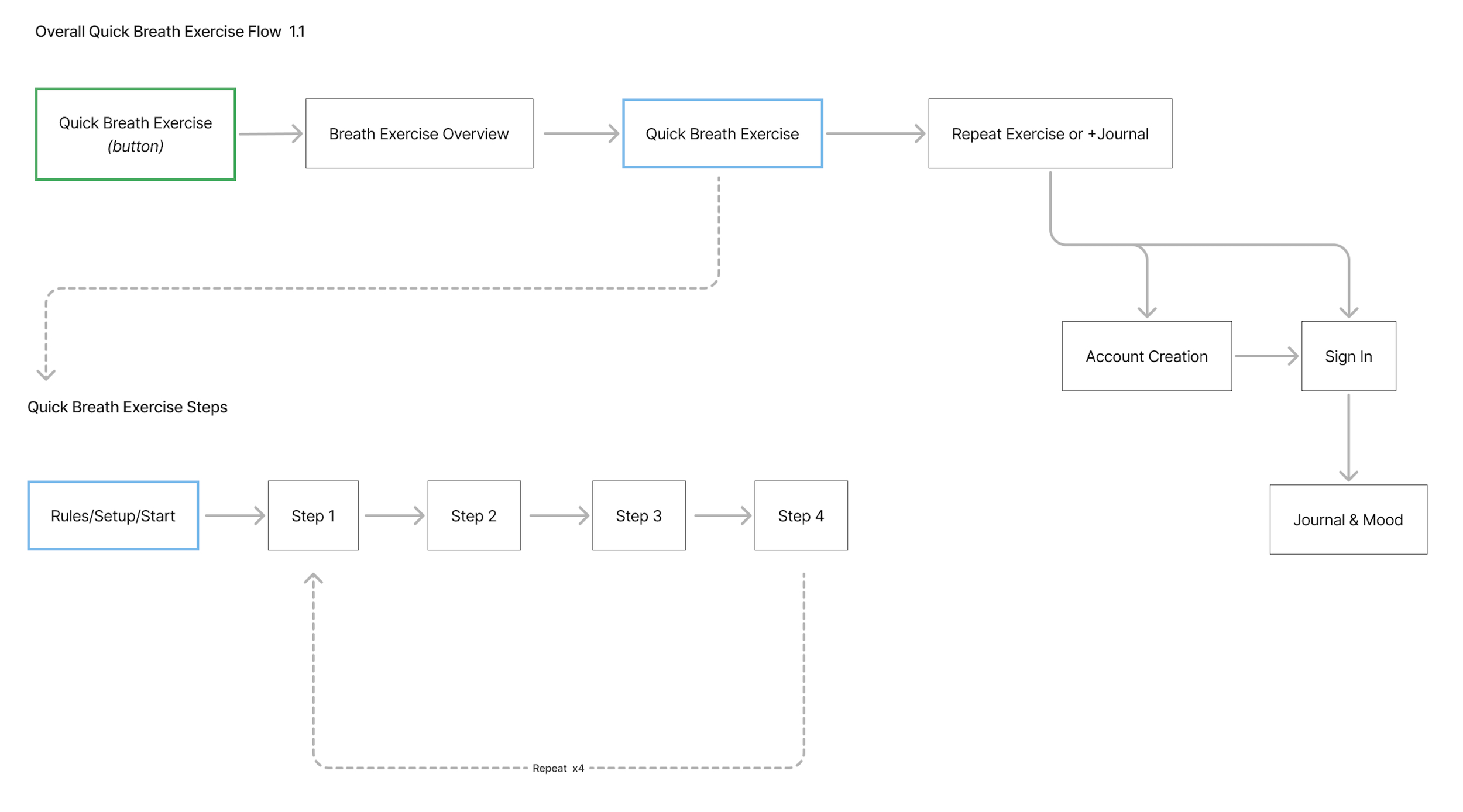
The next iteration focused on the core breath exercise flow. Since users are new to breathwork, they first receive key details before starting, then move through each breath cycle.
Core Breath Exercise Resources, Rules, & Steps

While designing the core breath exercise flow, I focused on key information for a smooth user experience, outlined supporting resources, and defined the steps and rules of the 4-7-8 breath technique.
Challenges
I needed to understand the user better and choose a default cycling method, with user testing serving as the first opportunity to validate their approach to the breath exercise.
Prototyping the demo and full breath exercise was challenging due to Figma's limitations.
As designs progressed, I streamlined the flows to simplify the user experience.
Combined User & Task Flows v1.3
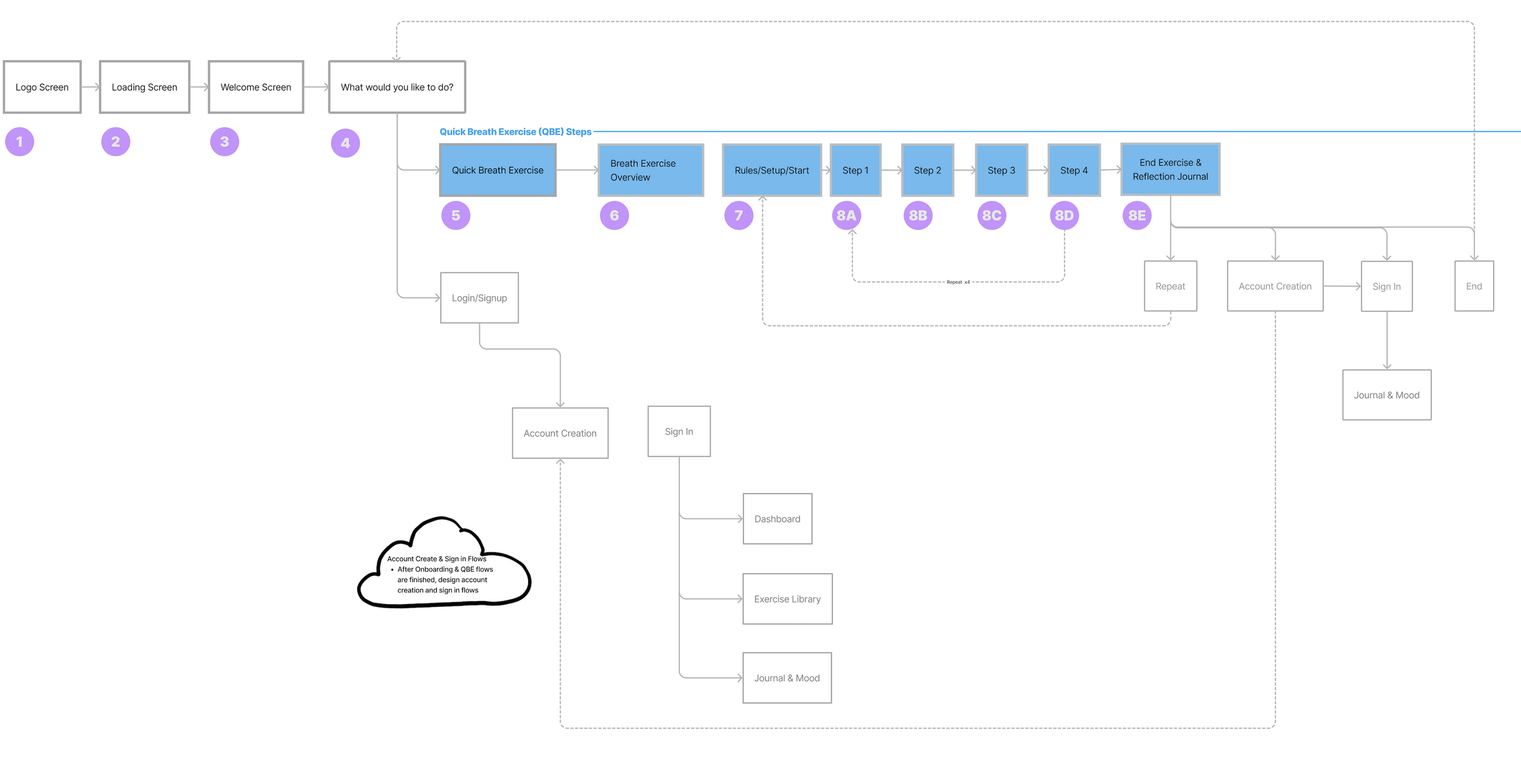
I combined the user flows (white rectangles) and core task flow (blue rectangles), numbering each step (purple circles) to pinpoint the screens to design. The light gray, unbolded rectangles indicate screens not needed for phase 1.
DESIGN, PROTOTYPE, TEST & ITERATE
The focus in this phase was to design and test the core flow, site map, and navigation menu to ensure users understood the hierarchy of information.
Key Insights
Users were split 50/50 between manual and automatic cycles, so we’ll allow for preference choice in future tests.
The counter felt unintuitive, so I switched it from counting up to counting down.
The "Try Exercise" button was hard to find, so I moved it to the top for visibility and kept it at the bottom for users who scroll.
While 80% of testers found the breath bar intuitive, I aimed for further improvement.
Testers felt the overlay copy for manual cycling was too wordy, so I reduced the text and enhanced content hierarchy.
The demo was too similar to the live exercise, so I added a label and removed confusion by highlighting inhale/hold/exhale steps with color coordination. The demo now auto-repeats for users who linger.
Core Breath Exercise Flow - Sketch

This was my first attempt at conceptualizing the breath exercise flow. Sketching helped me understand screen spacing and how components fit together. Aubrey, the user persona, needed to clearly see her progress, know the next steps, and track which cycle she was in.
Evolution of the Core Breath Exercise
This video showcases the evolution of the core breath exercise from version 1.0 to 1.3, based on user feedback.
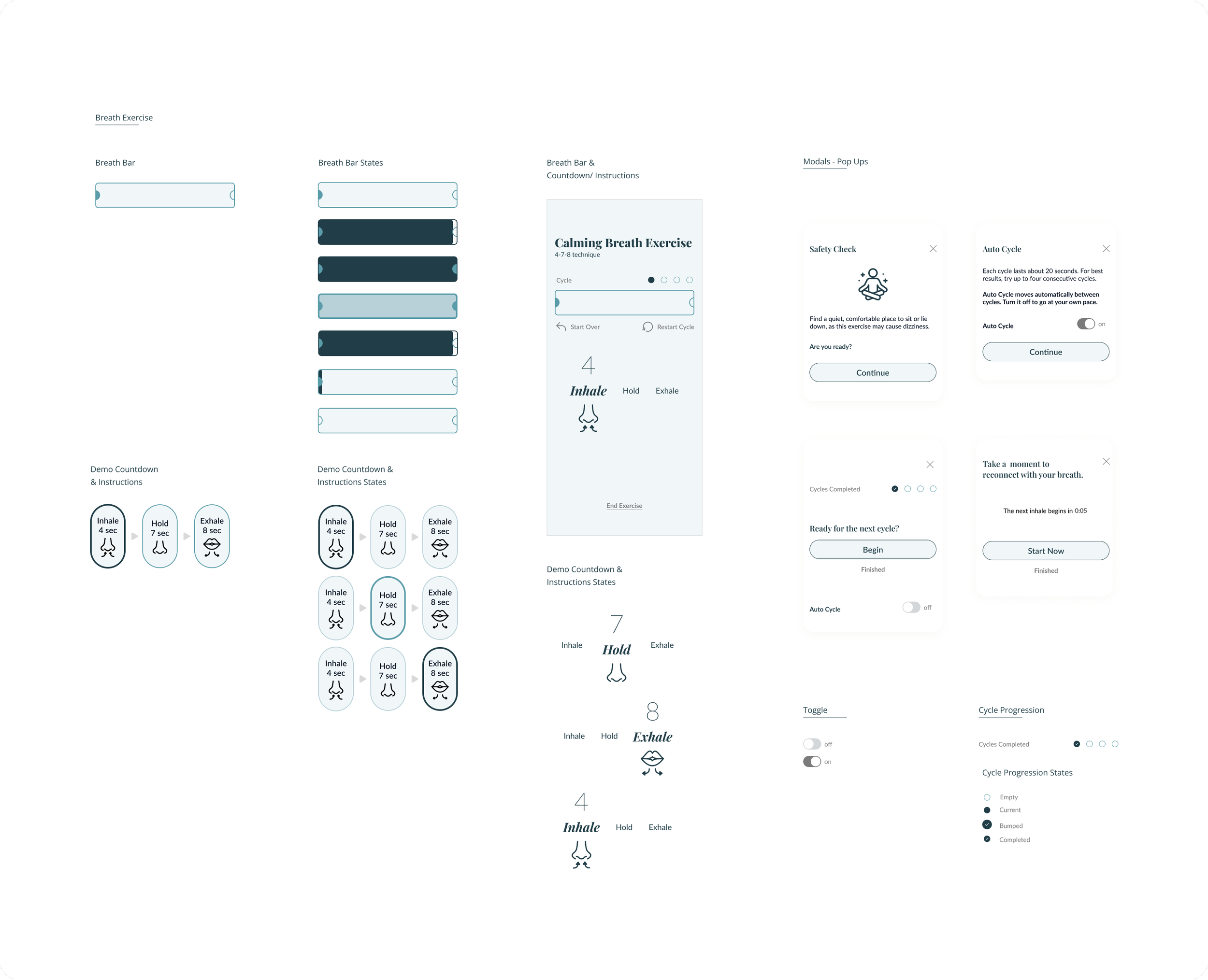
Breath Bar Versions
v1.0
Started with a circular breath bar, but it took up too much space, limiting room for instructions, countdown, and icons.v1.1
Updated to a more compact graphic, allowing space for instructions without scrolling, and expanded from the center.v1.2
Added branding elements and implemented user feedback by switching the counter to countdown.v1.3
Improved accessibility with better color contrast, removed sparkle animation, added color indicators, and changed the breath bar shape to reduce confusion in user testing.
Prototyping
Prototyping was challenging due to Figma’s limitations with animations and syncing multiple moving parts.
Challenges
I needed to sync the sparkle animation, breath bar, and instructions, but Figma's interactions couldn't handle complex animations, drop-downs, or carousels.
Impact
I had to relink the animation for the breath-holding phase and think creatively to connect time interactions across cycles. To improve usability, I redesigned the breath bar to move left to right, adding clear distinctions for each step. One tester confirmed the new pattern was more intuitive.
BRANDING & UI
Designing a Calm and Restful Identity
While waiting for test results from the wireframes, I shifted focus to branding, having a clear understanding of the problem, solution, and user. I created an evolving mood board, explored color palettes, and used AI to generate images that reflected the brand’s calm, enlightening feel. I experimented with names, shapes, colors, and typography, knowing from research that thoughtful animation would resonate with users.
Lumae Mood Board
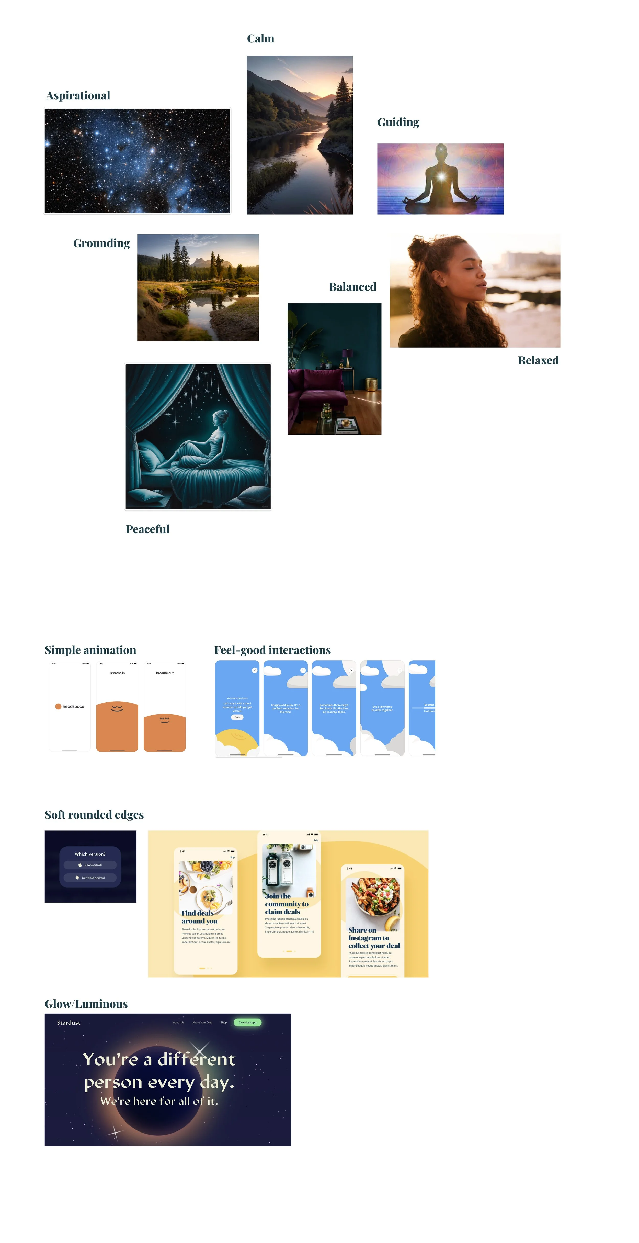
The mood board helped shape the Lumae brand by reflecting key adjectives like calm, grounded, and balanced, based on Aubrey’s needs. I chose animation to match competitor trends, rounded edges for a soft, approachable feel, and a gentle glow to align with the brand’s peaceful tone.
Challenges
The main challenge was designing a simple, non-overwhelming animation within Figma's limitations. I chose a sparkle effect after considering other options like clouds, as it aligned with the brand’s relaxing, illuminating vibe and was quick to create given the project’s timeline.
Initial Brand Ideas
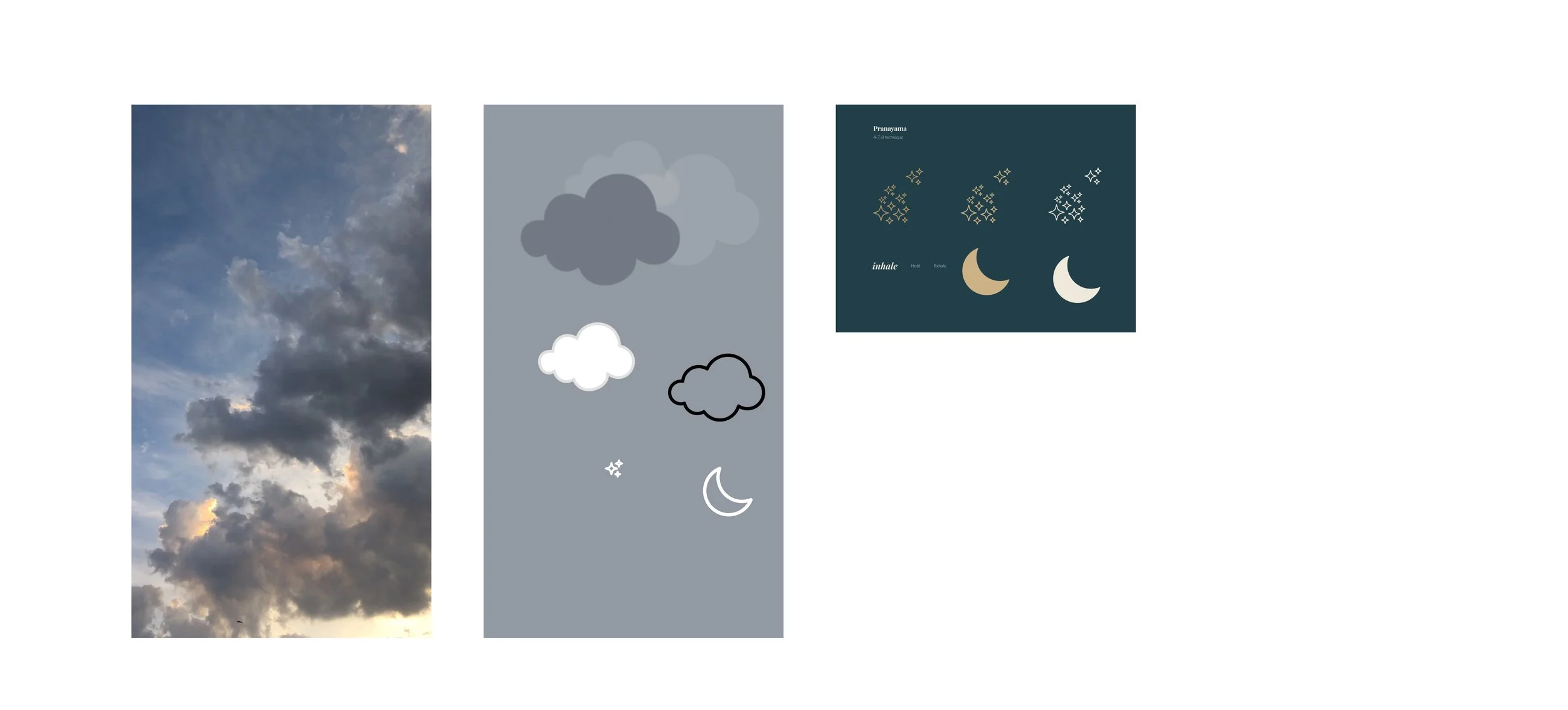
I explored various brand ideas and animations, including realistic clouds, moons, and stars. However, video clouds proved difficult for accessibility and required a dark overlay, which defeated the calming effect. The clouds and moon felt too tied to nighttime, limiting the app’s potential as it expands to include non-night-related breath exercises.
Branded Style Tiles
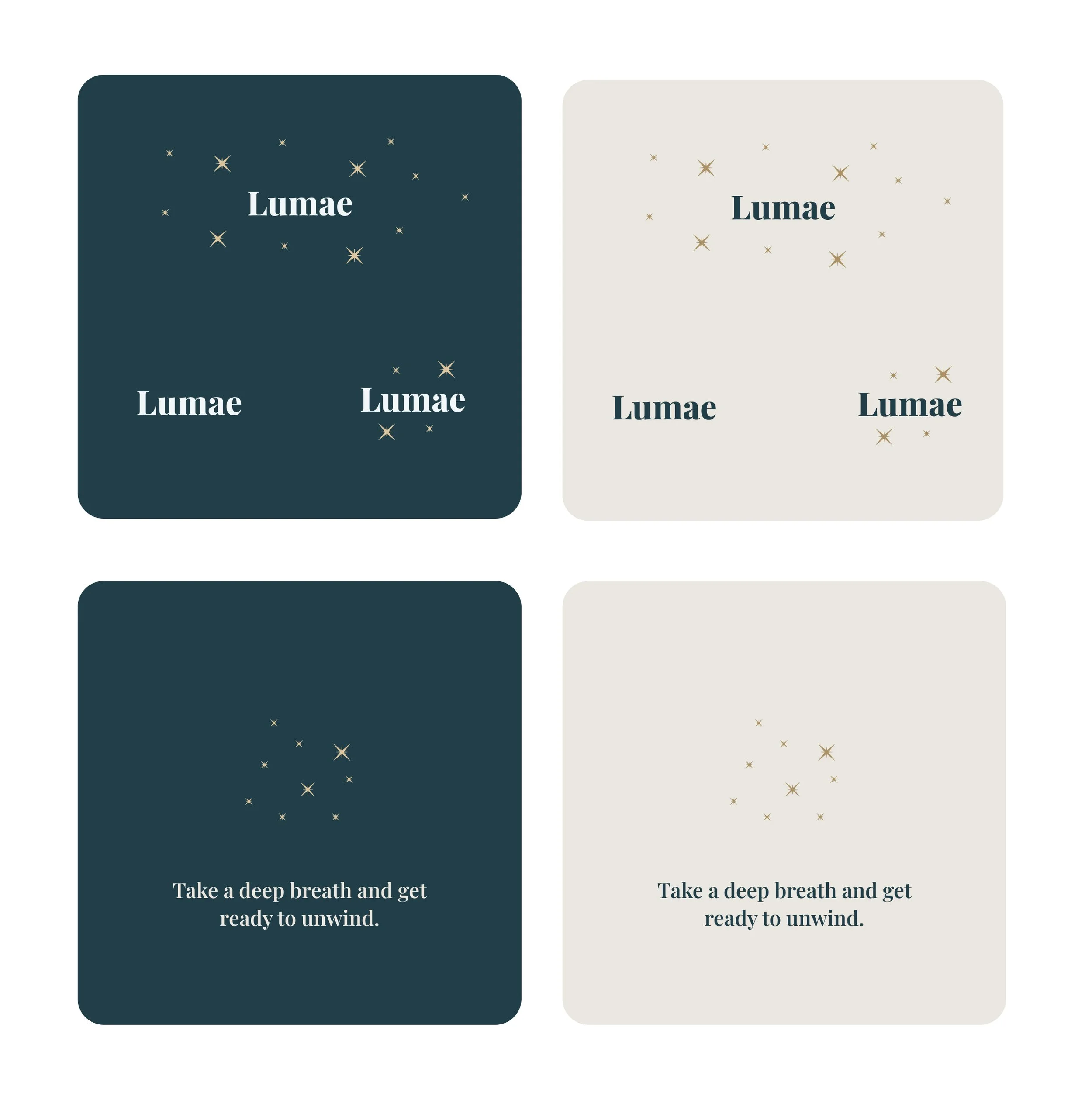
I named the app Lumae and designed a custom sparkle graphic to reflect its calming brand.
Lumae Animations in Action
Lumae Brand Elements
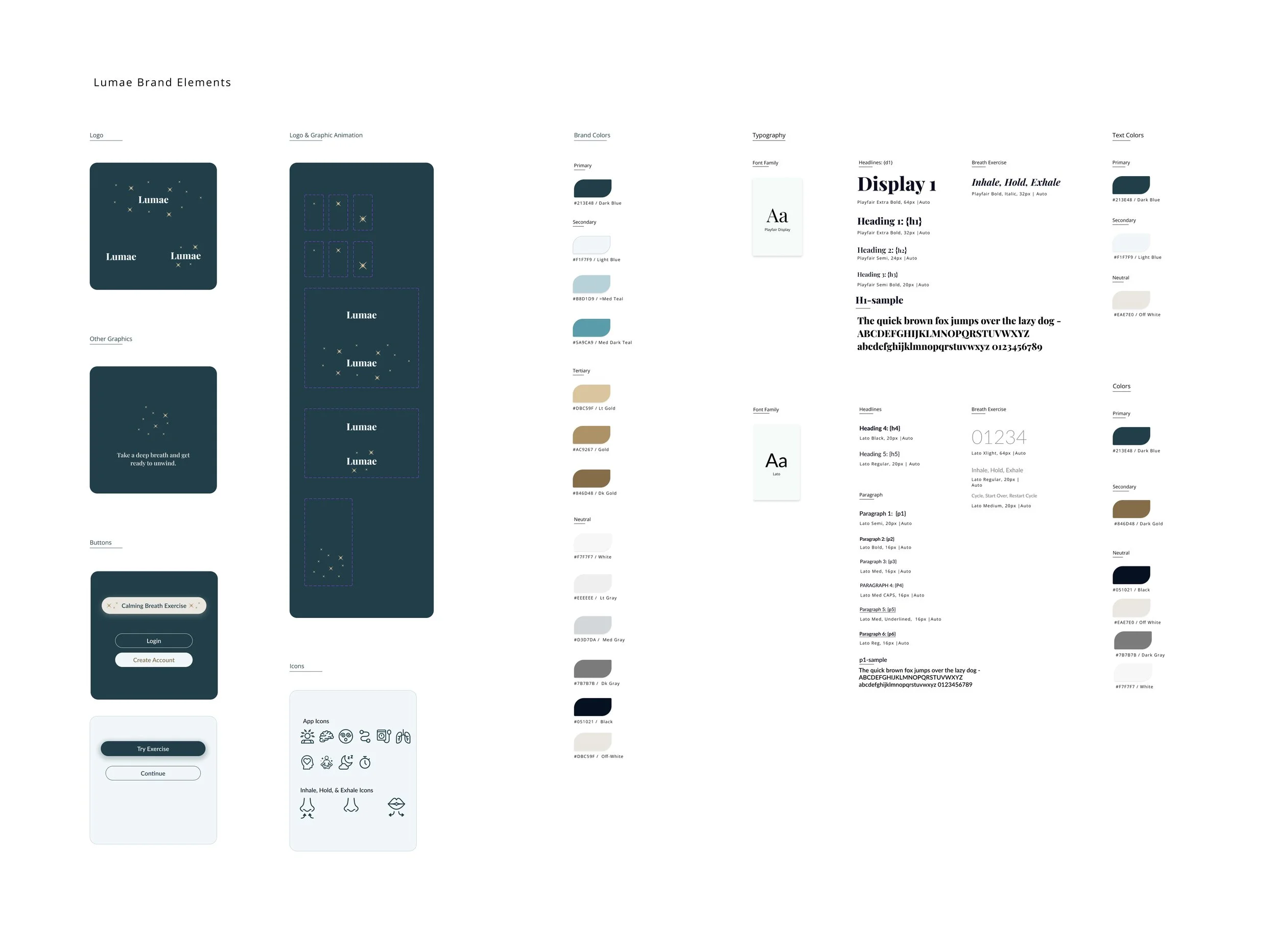
I chose a deep teal, blending blue and green, to evoke calmness. For typography, I selected Playfair Display and Lato to enhance readability and text hierarchy. I also defined colors for future light and dark modes to improve the user experience.
Additional Breath Exercise Elements
Components for designing the breath exercise flow in Figma.
User Impact
Testers described Lumae as calm, dreamy, and relaxing, evoking feelings of night or dusk.
Initial Prototype After Round 1 of User Testing
NEXT FIDELITY, TEST & ITERATE
Objectives
Confirm previous changes based on user testing.
Identify additional must-have features, focusing on user cycle progression.
Gather feedback on branding to assess its impact.
Ensure users can easily navigate from the home screen to the breathwork exercise and complete it.
User Test Results Comparison
Breath exercise task completion: 100% of users completed 2 manual cycles from the opening screen.
Scale: 1 (very hard) → 5 (very easy)
Round 1: Mean of 3.25
Round 2: Mean of 4
Difficulties with the exercise: 75% found the task easy to follow.
Likes/Dislikes:
Disliked manual cycle progression.
One participant felt the exercise started too early.
Too many clicks to begin.
Actions Taken
Analyzed scores and feedback, noting no difficulty in follow-up.
Added visual cues to the breath bar to clarify when the exercise starts, progresses, and ends.
Prioritized a safety check for beginners and allowed user control between manual and auto cycles.
Consolidated screens and text to streamline the experience.
Additional Insights
✅ 100% preferred the live countdown for the breath exercise.
✅ 75% preferred automatic cycles, with the remaining 25% choosing manual. The default was switched from manual to auto.
❌ Mixed feedback on text volume; adjusted content hierarchy to improve clarity.
❌ Users requested more functionality, like switching between manual/auto cycling; planned for later prototype iterations.
Manual & Automatic Cycle Flows & Prototyping
High Level Overview of Auto & Manual Cycle Flows
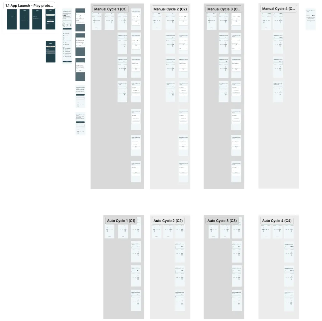
I refined the manual cycle flow first to make the auto cycle flow and prototype more efficient. Once both flows were established, I prototyped and connected them.
Additional Manual Cycle Screens
Extra screens were added to allow users to complete each manual cycle.
Additional Manual Cycle Screens
FINAL ITERATION & PROTOTYPE
Active Prototype
Outcomes
Key Accomplishments
User-Centered Design: The 4-7-8 technique was chosen as the core flow for phase 1 to directly address users' need for better rest with a simple, effective method.
Refined User Experience: 100% of users successfully navigated the app through two rounds of the breath exercise.
Validated Brand Identity: Users associated Lumae with relaxation and calm, aligning with the app's goal of improving rest.
Design Insights
User Testing Highlights
75% of users prefer automatic cycles over manual.
Reduced text and steps to avoid overwhelming users while maintaining essential information.
The flow of the breath exercise aligns with how users naturally think about it.
Prototyping
Switched from a center-expanding to a left-to-right countdown bar for better intuitiveness.
Clarified the difference between the demo and live exercises using color coordination and clear content hierarchy.
Strategic Differentiation
Narrowed the focus to rest and sleep through breathwork, filling a gap in the competition.
Positioned Lumae as beginner-friendly with a simple, guided approach.
Kept AI simple for easy feature expansion while focusing on usability.
Quantifiable Results
100% of users successfully completed the intro screen and 2 manual breath cycles.
Next Steps
Test high-fidelity iterations and prioritize changes based on feedback.
Research and design additional breath exercises for different types of rest.
Consider adding user-customizable cycle settings to align with preferences.
Add audio options for users who prefer a phone-free experience, increasing accessibility and engagement.
Key Challenges & Learnings
I relied on research to guide each design stage, addressing the challenge of introducing breathwork in a simple, digestible way for diverse users.
Challenges
Understand the problem and keep designs simple for all user types.
Establish foundational branding and IA to scale for future stages.
Lessons Learned
Use small-scale user testing to clarify assumptions and guide progress (e.g., testing logos or how users approach breath exercises).
Define project direction first, then design with scalability in mind.